

Just yesterday Cassandra Clare announced on her Tumblr, that a new paperback version of each book is being released here in the US and in Canada. Clare explains the reasons as to why she feels the need to go through a cover change, "my publisher has wanted to redesign the covers for a long time, but needed to finish out TMI first. They have for a long time wanted to make the Shadowhunters books overall look more unified...and also make them look more modern — the first book was designed ten years ago, and book styles change."
Sounds like good reasoning, but I'm a faithful believer in "if it ain't broke, don't fix it". The original covers are amazingly beautiful, and catch anyone's attention who walks by. But Clare becomes reassuring and continues on by explaining who is designing the covers, "these covers were designed by Cliff Nielson, who also did all the other Shadowhunters covers. He’s always been a great designer and I’ve always loved his work. I am happy that the new design carries over elements of the old design...so that it’s more of an updating that a complete change."

I'm glad to see that its the same designer from the original covers, instead of someone new. He knows what he's doing, he knows the story, and he knows the characters. I'm hoping that he also knows what the fans like and expect. I'm also glad to see that Clare doesn't want the cover to change entirely, but become more of an updated version; still carrying some of the same elements we've all come to love.
Finally, Cassandra Clare describes what we should be seeing from these covers in the future, "each cover will feature one character. The first three will be Jace, then Clary, then Simon. But this time around you’ll also get to see Alec have his own cover, and Isabelle have hers."

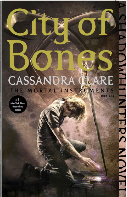
Looking at the new City of Bones cover, you can quickly see some of the similarities it has towards the original covers...not much...but it does. It also includes a few elements from the story itself, which I think is a positive thing.
There are some things that I like about this cover, and some that I don't. I like that the books will continue to "glow" just the original covers did, and I like that it includes elements from story, that give you a taste of what its all about. What I don't like is how the title takes over half of the cover. It basically distracts you from the photograph and completely covers the Angelic Power symbol. Why have the symbol there, if the title is just going to be thrown over the top of it?
I already own the entire series, so I probably won't be buying these new paperback versions. But if I were to buy them over again, I'm not sure if I would stick to the original covers or move onto these new ones. For me, its a toss up. I love the old covers, but there are also some things I like about the new ones.

What do you think? Which ones would you reach for?

No comments:
Post a Comment
I love hearing what you guys have to say, so don't be shy and leave a comment!